BRAND REINVENTION

Ask

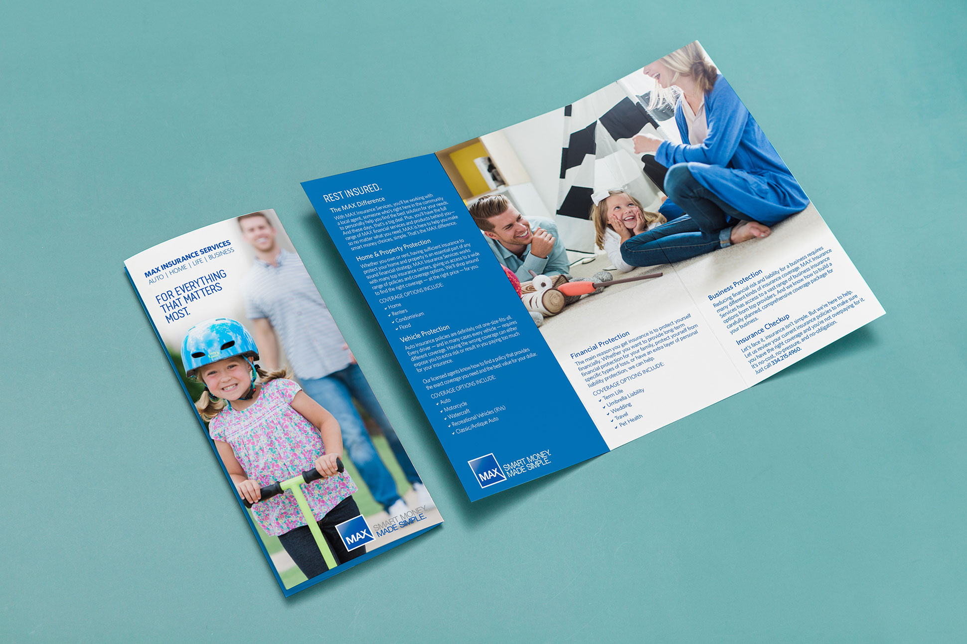
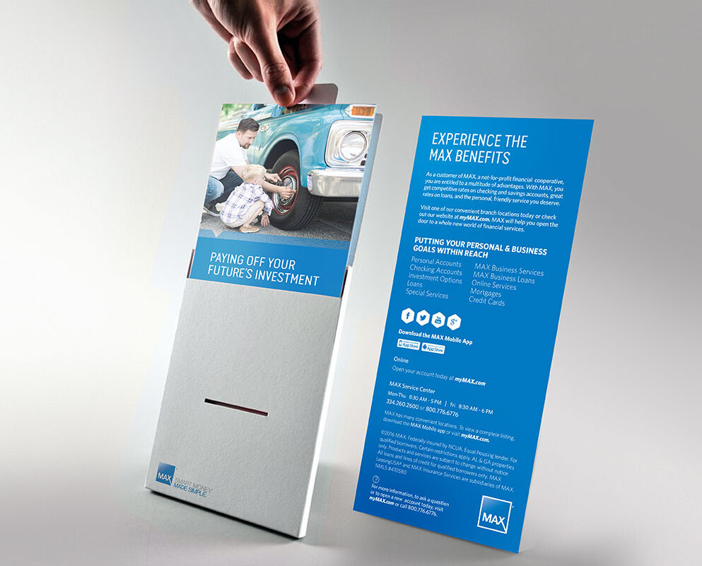
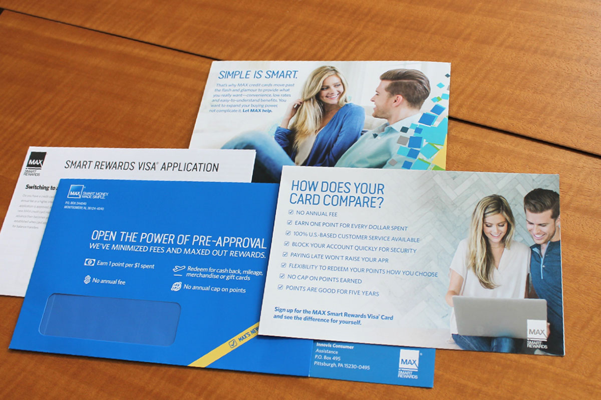
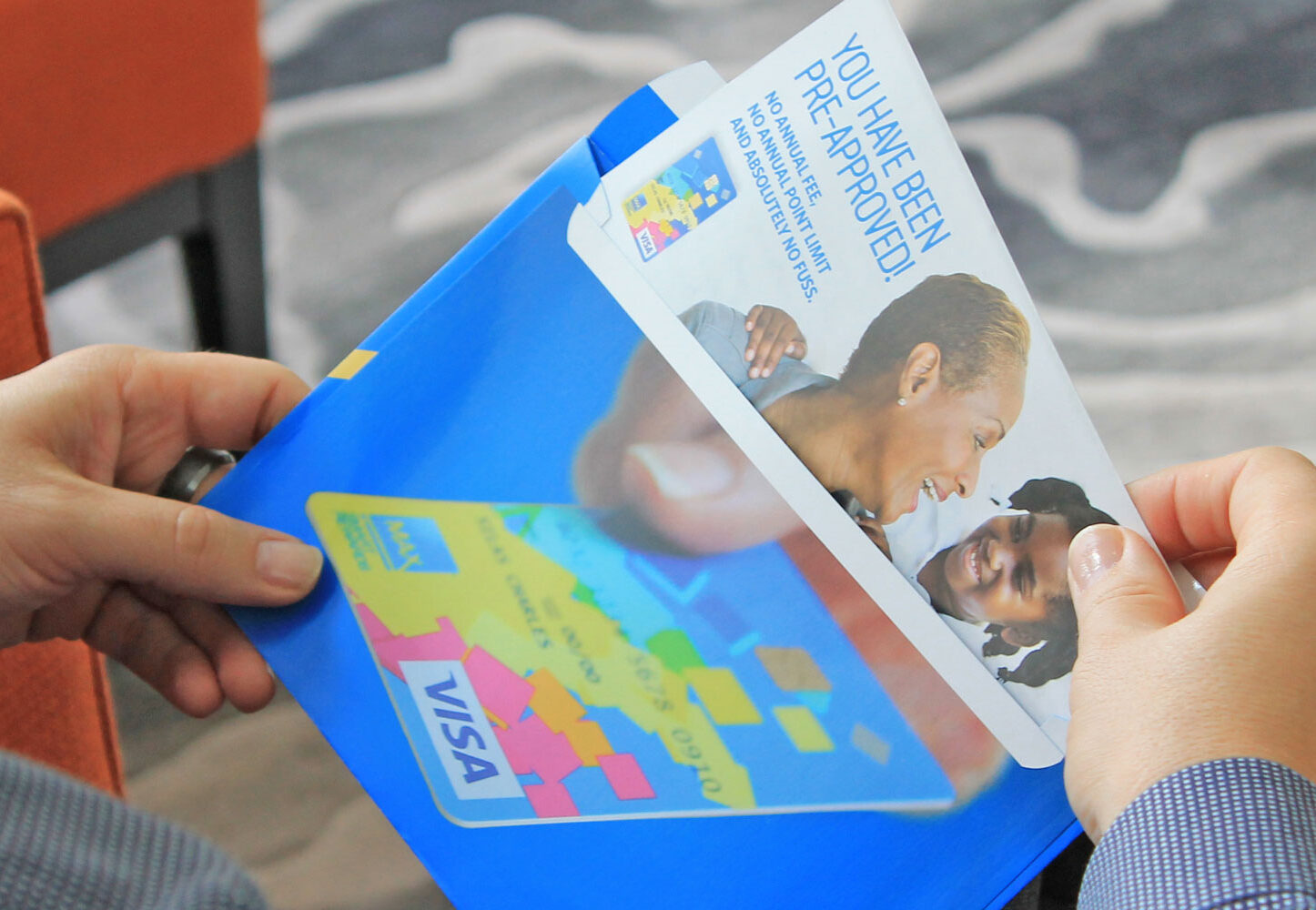
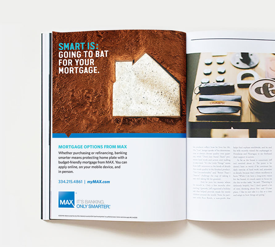
In a rapidly evolving and increasingly competitive market, MAX Credit Union recognized the need to update its brand and connection strategy to compete with traditional banks. The credit union understood the importance of staying relevant and appealing to current clients while attracting new ones. To achieve this, MAX embarked, with Hierarchy, on a journey of transformation to refresh its brand expression while retaining its existing brand mark.

Business Objectives

MAX Credit Union sought to enhance its representation within the community and build stronger relationships with its clients. As part of this goal, MAX encouraged clients to convert from single to multiple accounts, enabling them to access a broader range of financial services and enjoy a more comprehensive banking experience.

Disciplines

BRANDING

MARKET RESEARCH

DIGITAL MARKETING

PHOTOGRAPHY

Approach

Based on extensive market research of the surrounding service area, Hierarchy identified several areas of opportunity for MAX Credit Union, including multi-generational households, underrepresented demographics, and the underbanked. Hierarchy used these insights to develop a new brand expression and tagline – “Smart Money, Made Simple” – as the foundation of a customer-focused campaign.

The new brand expression and tagline were incorporated across all channels, from products and services to people. Hierarchy also developed a robust new narrative that positioned MAX Credit Union as a forward-thinking institution that extended the financial conversation to multi-generational households. Through this approach, MAX aimed to build deeper relationships with its clients and provide them with a more streamlined and accessible banking experience.

Callouts:

  • A comprehensive photo shoot was conducted to create an inclusive brand image library that prominently featured multi-generational families.
  • The marketing of every business line was streamlined through a simplified design and messaging strategy.
  • Lifestyle imagery played a crucial role in marketing materials, ensuring that the visual representation of generational families was consistently communicated across all business lines, emphasizing knowledge and wealth transfer.
  • A unique brand voice tone was explicitly developed for out-of-home advertising opportunities to capture attention and generate interest.
Hi_LOGO_WHT_2023

730 Peachtree Street NE, STE 570
Atlanta, GA 30308  

Hierarchy Inc BBB Business Review
nglcc_logo

Hierarchy Inc uses Accessibility Checker to monitor our website's accessibility.

en_USEnglish